Croner professional is a HR case issue and Employee tracking tool used primarily by the HR and line managers of businesses.
View Prototype.UX/UI
The Brief
I was tasked to redesign Croners - Croner Professional system. It was super outdated visually, its overall information architecture was chaotic and difficult to navigate. All these discrepancies were causing low engagement and generally negative feedback from CP users.
The Approach
1. Meetings with Product Owner and Developers to acquire general knowledge about the systems operations and website's usage.
2. Conducting a participatory design session with various categories of the users, identifying common user flows and building up the website's information architecture.
3. Prototyping page layouts, testing, iterating design based on feedback and creating final deliverables.
Initial Research
There were known issues with the information architecture, navigation and interaction design.
The navigation didn’t allow users the freedom to move simply and the interaction design was inconsistent across the site. The information architecture was not intuitive and at times confusing.
Knowing about the issues was a good start, but obtaining data from real users that would support or contradict any assumptions was what was required before we started designing anything that would have an impact.
Obtaining Data
To get a clear understanding of the current situation. I used a variety of methods for gathering different types of data.
Qualitative
- User testing
- User Feedback Poll
Quantitive
- Scrolling / Click behaviour heat maps
- Customer satisfaction poll
I set up a test across the whole journey Starting at the homepage to the point where the user creates an issue.
The test was made up of 5 Tasks using existing existing Croner customers and in-house Consultants.
Test Discovery
1. Users said the content wasn’t clear , it’s not obvious what to do.
2. Confusing to navigate, there is no consistency.
3. Users said that there’s a lot of information but presented horribly.
4. Users said the software looks very outdated and unreliable.
User Feedback Poll
I ran a user feedback poll asking users and our in-house consultants - “ What they thought we can do to improve your experience “
The poll received 432 responses.
UX Issues
- Poor navigation
- irreelvant content
- inconsistency
Users Comments
- “Not mobile friendly. I want to be able to use it on my phone. “
“ It needs a makeover. The sites looks old”
“ Homepage just has unnecessary information”
The feedback started to confirm my beliefs and I knew these was issues that needed to be addressed.
Heatmaps and Click Analytics
Heatmaps tracking clicks and scrolling behaviour offered further insight into how real users were engaging with the interface.
The results revealed that 90% of users wasn’t interested ‘ recent updates ‘ content displayed on the homepage and it hardly received engagement.
Customer Satisfaction Poll
Customer Satisfaction is the simplest way to understand if the user likes your product or not. Running this survey was a good way to gauge how the existing users felt about the software.
The result of this ,most users were somewhat ‘Satisfied' or ‘Neutral' - Which is not that great. The ideal scenario is where users are all either ‘ satisfied’ or ‘ Very satisfied ‘ . these experiences are more likely to be remembered and result in high client retention, loyalty and product repurchase.
Conclusion
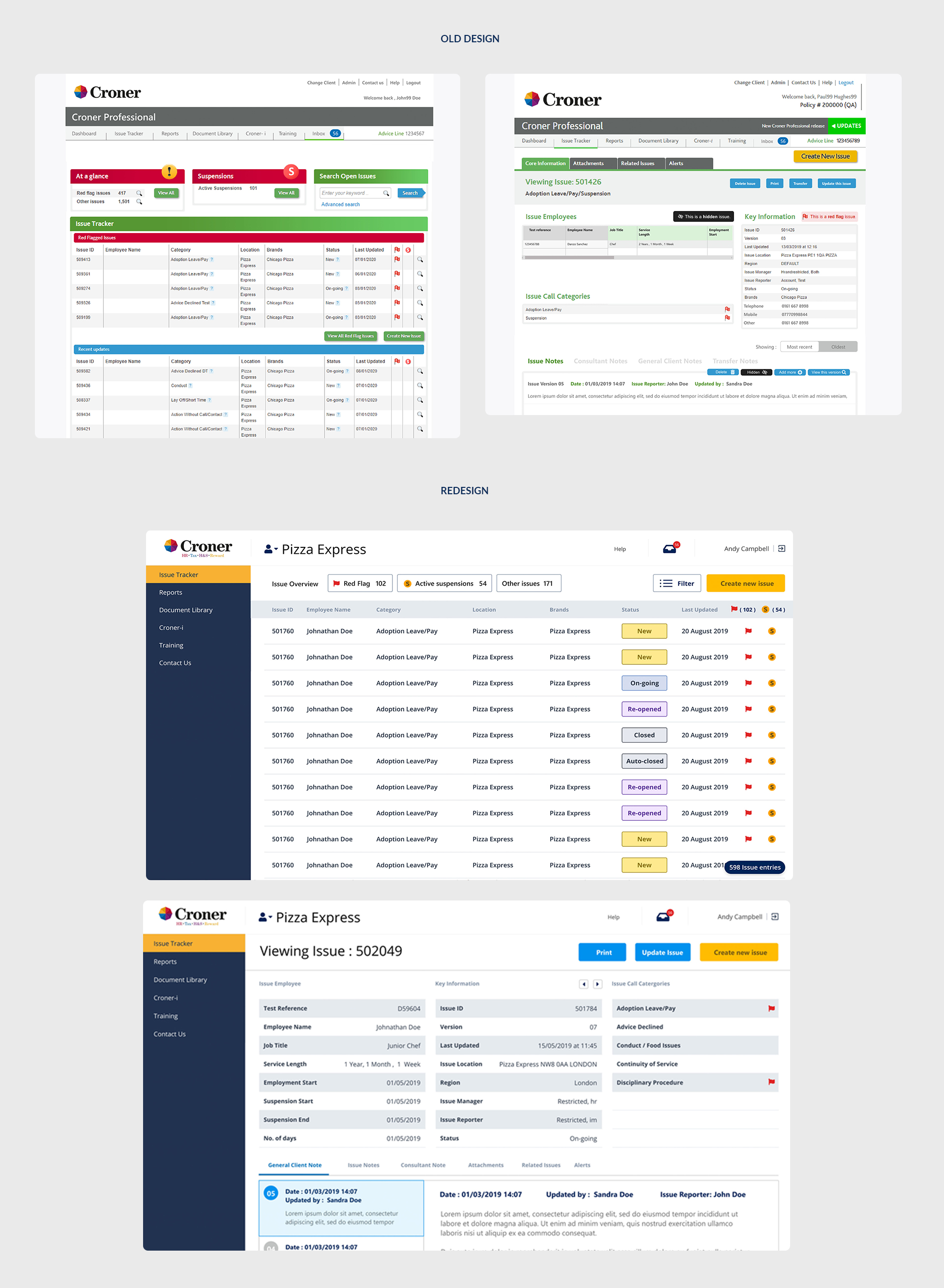
After gathering key information on how Users use the system. The research revealed issues all around the website. Some of them were technical limitations and others were purely design related.
I’d learned through click analysis and website analytics that users just want to quickly reach information about an individual. Every UX and visual design decision was made with this in mind
Special attention was spent on the details to declutter and rearrange the information presented, bringing consistency across screens with a polished interface.
The existing brand was dating fast and not very cohesive. I made the colours punchier and introduced cleaner , Friendlier type.
Wireframe , Prototype , Test
The first wireframes I drafted clarified topics from the research and what improvements where needed to be made on the software
Main Points
1. How is the software going to look on different devices ?
2. How can we make the design flexible enough to work with the existing content.
3. How will the new design meet SEO requirements without diminishing user experience
4. What content is needed and what was irrelevant to display
Let there be prototypes
After agreeing on a set of wireframes it was time to build a high fidelity prototype and get it into testing . I applied my UI knowledge and built a High-fidelity Adobe XD prototype for Desktop User testing.
The first test involved 5 participants and produced a usability score of 86. Analysing the videos, i found that there were some issues which could be improved.
Listening to the users helped with newer iterations with and to make the product better.
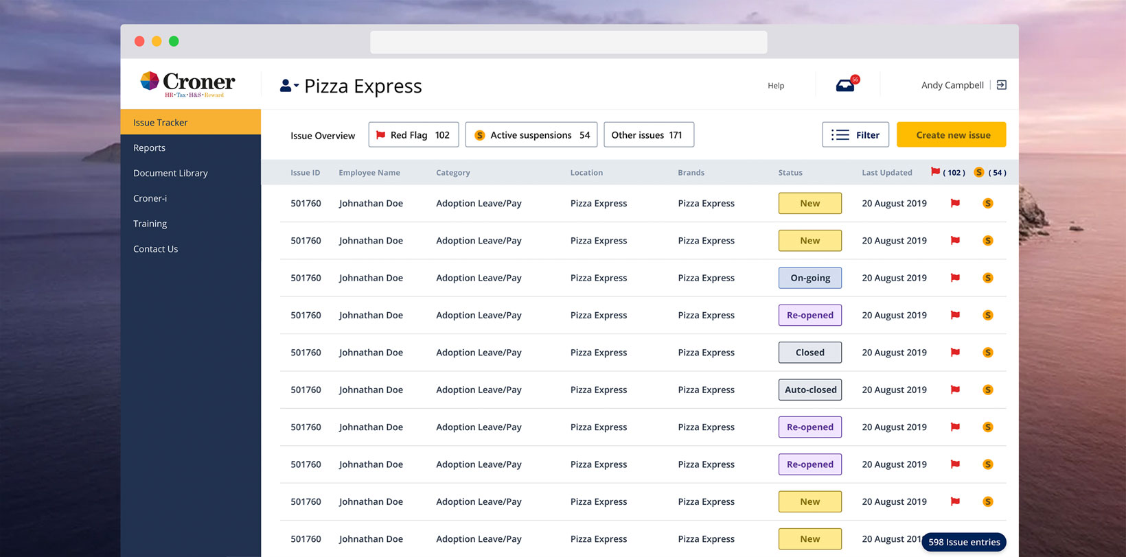
End Product
The new software redesign was well received within the company. While it has not yet been released, it has already increased productivity within the company by becoming a rallying point for strengthening internal community.
Another by-product of this project was that it initialised the new mobile product design.